Instance Settings
A separate date entry instance is created for each invocation of
$(selector).dateEntry();.
Each instance may have different settings for their input field(s), e.g.
$(selector).dateEntry({dateFormat: 'ymd-'});Alternately, you can specify the settings per control by adding them to the data-dateEntry
attribute (provided they are simple values or arrays), e.g.
<input type="text" data-dateEntry="dateFormat: 'ymd-', minDate: 'new Date(2014, 1-1, 1)'"/>Below are the settings that may be applied to each date entry instance. All are optional.
A note on Date - the JavaScript Date constructor expects
the year, month, and day as parameters. However, the month ranges from 0 to 11.
To make explicit what date is intended (does a month of 3 mean March or April?)
I specify the month from 1 to 12 and manually subtract the 1.
Thus the following denotes 25 December, 2014.
$(selector).dateEntry({minDate: new Date(2014, 12-1, 25)});altField | altFormat | appendText | beforeShow | dateFormat | dayNames | dayNamesShort | defaultDate | initialField | maxDate | minDate | monthNames | monthNamesShort | spinnerBigImage | spinnerBigSize | spinnerImage | spinnerIncDecOnly | spinnerRepeat | spinnerSize | spinnerTexts | tabToExit | useMouseWheel
| Name | Type | Default | Comments |
|---|---|---|---|
| dateFormat | string | 'mdy/' | The format for the date display. The first three characters indicate the order of
the fields: 'y' for four-digit year, 'Y' for two-digit year, 'm' for month,
'n' for abbreviated month name, 'N' for full month name, 'd' for day,
'w' for abbreviated day name and number, 'W' for full day name and number,
or ' ' for nothing (only in third position).
The remaining characters are the separator(s) allowed between these fields.
The first separator is used when displaying the date and must always be present,
while the remainder are allowed when parsing or entering a date. This is one of the
regional settings fields.Since 1.0.5 - 'Y' format and additional separators. Since 2.0.1 - ' ' format. |
| monthNames | string[12] | ['January', ..., 'December'] | The names of the months. This is one of the regional settings fields. |
| monthNamesShort | string[12] | ['Jan', ..., 'Dec'] | The abbreviated names of the months. This is one of the regional settings fields. |
| dayNames | string[7] | ['Sunday', ..., 'Saturday'] | The names of the days, starting at Sunday. This is one of the regional settings fields. |
| dayNamesShort | string[7] | ['Sun', ..., 'Sat'] | The abbreviated names of the days, starting at Sunday. This is one of the regional settings fields. |
| appendText | string | '' | Add content to display after each date field. This may contain HTML markup. |
| initialField | number | null | The number of the portion of the date field to highlight initially.
Use 0 for the first field, or null for the user selection.Since 2.0.1 - default is now null. |
| tabToExit | boolean | false | true to have the tab key exit this field and move to the next one,
or false to have the tab key step through the date subfields.Since 2.0.0. |
| useMouseWheel | boolean | true | true to use the mouse wheel for increment/decrement if possible,
or false to never use it. |
| defaultDate | Date or number or string | null | The default date to show when no other value has been entered.
This may be a Date object, a string in the current
dateFormat, a numeric value indicating days from today,
or a string value indicating a number and units. In the latter case, use 'y' for years,
'm' for months, 'w' for weeks, or 'd' for days. Letters may be upper or lower case.
Multiple offsets may be combined into one setting.
Leave as null to default to the current date.Since 1.0.5 - may be a string in the current date format. |
| minDate | Date or number or string | null | The minimum date that may be selected, or null for no limit. See
defaultDate
for a description of the possible formats.Since 1.0.5 - may be a string in the current date format. |
| maxDate | Date or number or string | null | The maximum date that may be selected, or null for no limit. See
defaultDate
for a description of the possible formats.Since 1.0.5 - may be a string in the current date format. |
| spinnerImage | string | 'spinnerDefault.png' | The URL for the spinner images to use, or '' for no spinner.
The file must contain seven images horizontally for the normal view, then
for each "button" pressed (now, previous, next, increment, and decrement),
and, finally, the disabled view.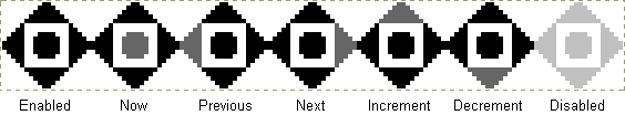 |
| spinnerSize | number[3] | [20, 20, 8] | The dimensions of the spinner image for determining which "button" was clicked. The first two values are the width and height of the individual images, the third is the size of the central button for setting the current date, or 0 for no central button. |
| spinnerBigImage | string | '' | The URL for an expanded spinner image to use, or '' for no expansion.
The layout is the same as for spinnerImage but should
be a larger size. The expanded spinner appears when the user hovers
over the original spinner and disappears when they move off it. |
| spinnerBigSize | number[3] | [40, 40, 16] | The dimensions of the expanded spinner image for determining which "button" was clicked. The first two values are the width and height of the individual images, the third is the size of the central button for setting the current date, or 0 for no central button. |
| spinnerIncDecOnly | boolean | false | true to have only the increment and decrement buttons on the spinner,
or false for all the buttons. |
| spinnerTexts | string[5] | ['Today', 'Previous field', 'Next field', 'Increment', 'Decrement'] | The tooltip text for the spinner buttons. This is one of the regional settings fields. |
| spinnerRepeat | number[2] | [500, 250] | The times in milliseconds for the auto-repeat feature on the increment and decrement spinner buttons. The first value is the initial delay and the second one is the subsequent delay. Hold the mouse button down on these spinner buttons to trigger this feature. Use [0, 0] to disable the auto-repeat. |
| beforeShow | function | null | A function that accepts an input field and returns a settings
object containing new settings for the date entry for this field.
For example, you can use it to set up a date range wherein both
fields restrict the possible values of the other field.
this refers to the input field as well.
Leave as null for no per-field customisation. |
| altField | string or element or jQuery | null | Specify another field to be updated in sync with the date entry.
This and the following setting allow you to automatically show selected dates
in one format for the user, while maintaining a second field with a more
useful format for further processing. The alternate field may be specified
as either the element itself, a jQuery collection containing the element,
or a string selector for the desired element.Since 1.0.6. |
| altFormat | string | null | Use in conjunction with the altField
setting to automatically maintain two different views of the entered date.
See the dateFormat
setting for the list of possible values.Since 1.0.6. |